logo
Honestly, logo is marginal issue nowadays, when I have so much work to do. However, I want put logo design also no my board on Contepolary Arts lesson. And deadline is on this thousday (T^T), what I had to create it as quickly as it is possible.

It is my logo which I designed in last term, whose purpose was to be part of my bOO Gallery project. At the time I was really happy with it, as a) it was simple to do b) this humble shape does not take attention away from main point which is of course building itself. However, the reason why I decided to use a bird, because my surname means sparrow in my native language. As you can see this logo is not relative because it is swan, not sparrow. So, I decided to created new one.
Here you can see my previous post how literally I created my logo using Illustrator:
https://prettychamsae.blogspot.com/2018/11/my-logo-on-my-website.html
https://prettychamsae.blogspot.com/2018/11/my-logo-on-my-website.html
I found a photo of origami sparrow and again I tried to draw it in Illustrator by using Line Segment Tool.
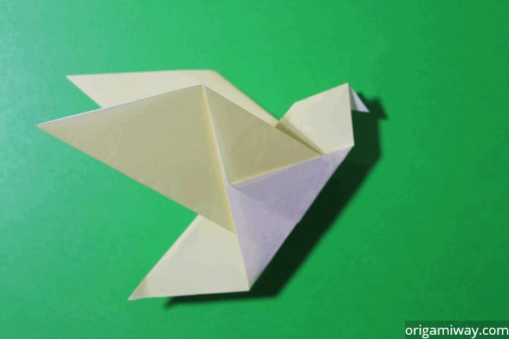
My first trial was unsuccessful, because the wings are to small comparing to all body. And head also need be improved:

I like second one more because it brings me sense of lightness. I thing proportion are correctly what makes me delighted:

Then I add some frame, by Rectangle Tool (M) and my name, by Type Tool (T). It was brainless, because of adding frame, it started look like image bird in cage. I do not want to be seemed as someone who is nameable, artist should be considers as free-minded, uncontrolled. So I dilated it. However, the title, slogan started to look quite fussy. That is why, I change the font and from horizontal make into vertical perspective.

My final logo:

Me practising drawing:


Don't forget to add the technical language regarding the tools you are using in illustrator to make the logo.
ReplyDelete